Data Clock Visualisation Library
This library allows the user to create data clock graphs, using the matplotlib Python library.
Warning
This library is a work in progress and is frequently updated. Double check aggregations using your input DataFrame and the aggregation DataFrame return value.
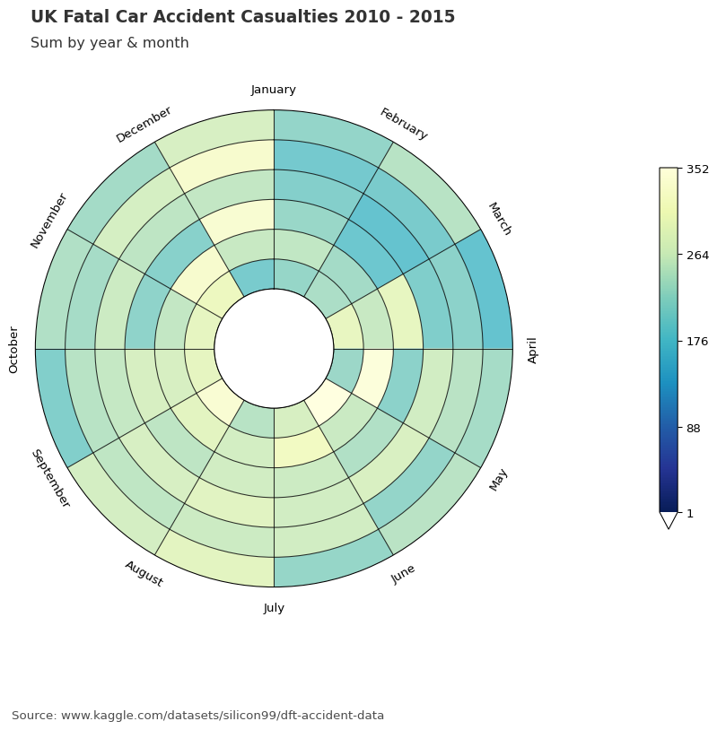
Data clocks visually summarise temporal data in two dimensions, revealing seasonal or cyclical patterns and trends over time. A data clock is a circular chart that divides a larger unit of time into rings and subdivides it by a smaller unit of time into wedges, creating a set of temporal bins.
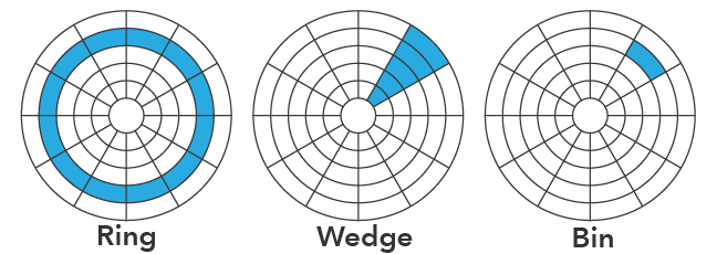
Image from ArcGIS Pro documentation.
These temporal bins are symbolised using graduated colors that correspond to a count or aggregated value taking place in each time period.
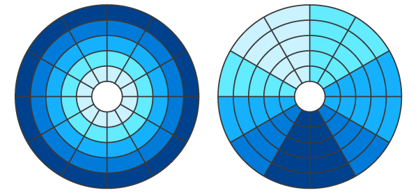
Image from ArcGIS Pro documentation.
The data clock on the left shows a temporal trend of increasing intensity over time, and the data clock on the right shows a seasonal pattern where intensity is consistently high in a few wedges.
Note
Currently, these graduated colours range between those defined in the following matplotlib.colormaps names; RdYlGn_r, CMRmap_r, inferno_r, YlGnBu_r and viridis.
The table below details the currently supported chart modes and the corresponding rings and wedges:
Mode |
Rings |
Wedges |
Description |
|---|---|---|---|
YEAR_MONTH |
Years |
Months |
Years / January - December. |
YEAR_WEEK |
Years |
Weeks |
Years / weeks 1 - 52. |
WEEK_DAY |
Weeks |
Days of the week |
Weeks 1 - 52 / Monday - Sunday. |
DOW_HOUR |
Days of the week |
Hour of day |
Monday - Sunday / 24 hours. |
DAY_HOUR |
Days |
Hour of day |
Days 1 - 356 / 24 hours. |
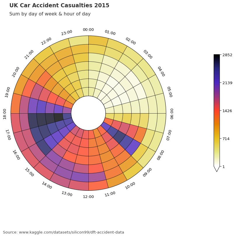
   from dataclocklib.charts import dataclock

   graph_data, fig, ax = dataclock(
      data=data.query("date_time.dt.year.ge(2019)"),
      date_column="date_time",
      agg_column="number_of_casualties",
      agg="sum",
      mode="DOW_HOUR",
      cmap_name="CMRmap_r",
      cmap_reverse=False,
      spine_color="darkslategrey",
      grid_color="black",
      default_text=True,
      chart_title="UK Car Accident Casualties",
      chart_subtitle=None,
      chart_period="Period: 2019",
      chart_source="Source: www.kaggle.com/datasets/silicon99/dft-accident-data"
   )
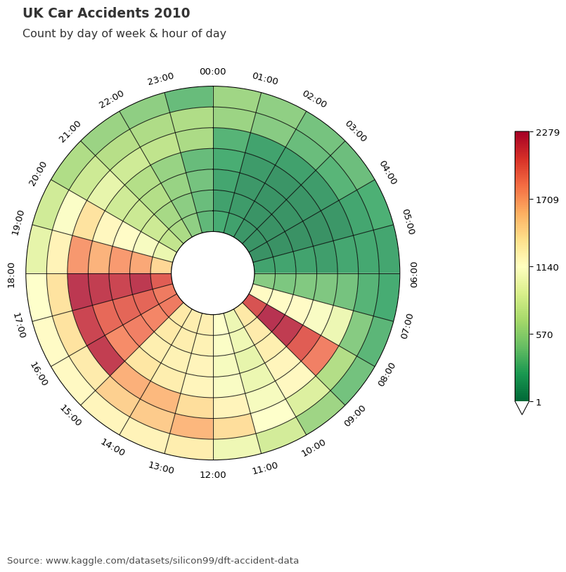
   datetime_start = "date_time.dt.year.ge(2020)"
   datetime_stop = "date_time.dt.year.le(2022)"

   graph_data, fig, ax = dataclock(
      data=data.query(f"{datetime_start} & {datetime_stop}"),
      date_column="date_time",
      agg_column=None,
      agg="count",
      mode="YEAR_MONTH",
      cmap_name="pal12",
      cmap_reverse=True,
      spine_color="black",
      grid_color="black",
      default_text=True,
      chart_title="UK Car Accident Casualties",
      chart_subtitle=None,
      chart_period="Period: 2020 - 2022",
      chart_source="Source: www.kaggle.com/datasets/silicon99/dft-accident-data",
      dpi=150
   )
   datetime_start = "date_time.ge('2019-01')"
   datetime_stop = "date_time.le('2023-01')"

   graph_data, fig, ax = dataclock(
      data=data.query(f"{datetime_start} & {datetime_stop}"),
      date_column="date_time",
      agg_column=None,
      agg="count",
      mode="YEAR_WEEK",
      cmap_name="Avedon",
      cmap_reverse=True,
      spine_color="black",
      grid_color="black",
      default_text=True,
      chart_title="UK Car Accident Casualties",
      chart_subtitle=None,
      chart_period="Period: 2019 - 2022",
      chart_source="Source: www.kaggle.com/datasets/silicon99/dft-accident-data",
      dpi=150
   )
Tutorial
- Basic Overview
A basic overview of dataclocklib chart creation.
- EDA Tutorial
A look at incorporating dataclocklib in your Exploratory Data Analysis (EDA).
Reference
- Dataclock API
Dataclock chart API reference.